Oil has been center stage since late 2014.
Most recently, after two years of depressed prices, OPEC agreed to curtail output by 1.2 million barrels per day at its meeting in Vienna in late November in an attempt to end the global supply glut. Several non-OPEC producers including Russia tagged along in December, agreeing to reduce output by about 560,000 bpd (slightly below the original proposition of 600,000).
Oil prices jumped on the news and are now about 18% higher than they were before the November announcement. WTI crude is trading around $53.62 per barrel, while Brent crude is around $55.78 per barrel as of 9:28 a.m ET 20 December.
Looking forward, a Goldman Sachs macro research team wrote in a note to clients that they see Brent crude oil prices peaking at $59 per barrel in the first half of next year as cuts are implemented. That should push the market into deficit in the first quart of next year, "which should shift the market into backwardation by the summer." They added that the "key" thing to watch will be OPEC's compliance and whether non-OPEC members deliver on their promised contribution.
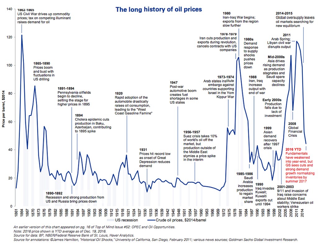
Notably, the oil-price volatility of the last two years is not without precedent.
The Goldman team also included a chart showing the 150-plus year timeline of oil prices (in 2014 US dollars) and related historical events.
For example, prices rose in 1895 after a cholera epidemic led to production cuts in Baku, Azerbaijan, and dropped to a record low in 1931 as demand plummeted during the Great Depression.